So in today's post I will be analysing the opening sequence of World War Z. This will be my third analysis. Unlike the previous two, this film shows us as the event intensifies from a small spark into something Earth shattering.
So the movie begins with the Paramount logo. This is company which distributed the film. Usually, these logos are the first ones the audience sees.
The next logos are of the company Plan B Entertainment, Skydance Productions, Hemisphere Media Capital and GK Films. These are the companies which produced the films. Depending on the film, some show only the distributor logo whereas other shows all the companies logos. Whilst these logos are playing, there is a low drum of a bass which sounds almost like thunder. Then a series of string instruments begins to play softly. The music then starts to thump in a series of random movements, successfully creating an abysmal mood.
At this point, the names of the companies appear again in white writing against a dark background, allowing the text to stand out and lets the audience know who helped with the process of the film. Immediately as the text appears, a piano riff begins to play over the tense background music alongside a rock guitar playing a similar tune. This adds to the dark mood that is bestowed upon us as it sounds very heavy and dispirited.

As apposed to The Day the Earth Stood Still, the name of the director is the first name to appear. Alongside his name is a clip of a flock of birds flying, framed in an odd shape. The sound of the birds screeching can be heard but it is very quiet as the background music is still dominant. The use of the birds can be used to signify life on Earth. Because it is an apocalyptic film, these types of images are used often as a reminder to the audience of what life once was. However, the beginning of the film is set just before the event happens so it also acts as a reminder of what we have to loose.


The next screen grabs are two of the main characters in the film. Pitt's name is first as he is the most recognisable and Enos' name is there as she is also a significant character. Both these actors play the role of the parents in this film, hence the suburban background. This could be an action code as it gives the audience information of these particular characters. The background acts as a reminder of who they were and who they still are. The music continues to play in the background.


More names of actors and actresses appear on screen. The shot remains wide as it allows the audience to read the names and still watch the action of everyday life in the background. These next few clips are of transport stations such as trains, undergrounds and subways. This is just another reminder of everyday life. The monotonous background music still plays. However, there is now a compilation of news reporters and talk show voices which can be heard clearly. Nothing significant is singled out in their voices as all of them are talking at the same time - this is yet gesture of everyday life.


Again there are more names of the stars in the film set against more images of normal mundane life. However, what's interesting is that as the images change, so does the non-diagetic dialogue of the news reports. In particular, a reporter discusses the properties of a virus and how it can adapt itself to transmit from human to human. This dialogue is by itself rather than in a compilation with other reports which allows us to hear it properly and realise its significance in the story line. At this point we know that this virus could perhaps be the reason why the world has become apocalyptic - it's a clue.


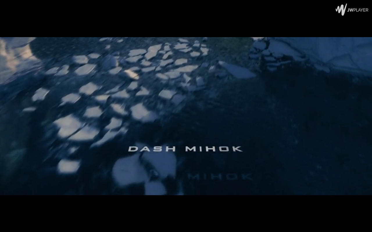
Now the key crew member's names are appearing on screen alongside the images. However, it is becoming more intensified as instead of talking about everyday life we now see images of natural disasters such as dolphins stranded on the beach. The use of mixing everyday life with these disturbing scenes could signify that the threat of distinction is looming over us. As the title continues there are more scenes of people wearing flu masks and reporters talking about an illness. Instead of just hearing the reporters, we now see them as they say their lines too. This allows us to give them our full attention as these reports are very significant. The shots remain wide and as the reports appear, there is no text on the screen alongside it - we have no choice but to listen to it, the threat is becoming more present. There are images of animals hunting then it cuts to images of humans in masks before cutting back to animal carnage. This represents to us the idea that the threat of the illness is hunting us down on by one, much like these animals. The images become faster and faster as the background music intensifies and quickens, simulating the hunt.

Suddenly, all the images we've previous seen as shown again in a very fast loop as the camera zooms out from the odd shaped frames as it reveals to the audience that the movie title was in fact framing the images. The tension from the background music increases and the TV reports are no longer playing - it's game over. The use of the stark contrast between the title and background further brings attention to the images and the title, allowing us to focus fully on it. The war between the illness and mankind has begun.
There aren't any obvious representations shown in this sequence unlike in the previous two which fully focussed on males. This sequence focuses on mankind in general, showing our everyday banal life on the threat of extinction. Because of this, I believe the target audience would be those of a mature age - similarly to IAL and TDTESS - as some images and situations may upset those of a younger age. Also, horror-science fiction hybrids tend to be made for those over the age of 15. It is a general convention of these types of films.
Now this wasn't particularly an interesting title sequence as all of the image were similar which made it harder to analyse than the first two. This is something I'm going to avoid as it doesn't narrate the story very well or introduce anything very significant other than the virus itself. There isn't a wide range of shots or movement which is, again, something I will avoid.
However, I do like the use of the text alongside images of people, animals and news reports. It helps to get a feeling of what life used to be like before the apocalypse and this is a feature I would be happy to use in my own title sequence.
So that is all for today's post.
Until next time,
Toni