In today's post I will be analysing the opening sequence to The Day After Tomorrow. Similarly to World War Z, this film is set moments before the apocalyptic event happens.
The title sequence begins immediately as the credits appear on screen. Centropolis Entertainment, Lionsgate and The Mark Gordon Company are the producers. The titles roam as if they are flying. The background music begins to play as a woman's voice starts to harmonise, creating an angelic feeling - it gives the sense of a heavenly presence.
The title of the film then appears and at this point, the background lightens up as we realise that the credits are roaming over an ocean. The music becomes denser as brass instruments are added, creating a more majestic feel to it.
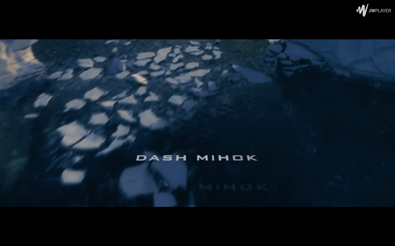
Then the names of the actors and actresses who star in the film appear one by one. By now we can clearly see that the opening credits are set somewhere in the Arctic as there are ice glaciers. String instruments are now playing in the background music along with some military drums. The use of the drums in particular are similar to the ones you would hear in a war sequence. This foreshadows the fact that soon enough, mankind will be at war with nature. The use of camera movement as we fly over the glaciers could signify that we are above nature, that's how it has always been. Yet, the fast paced movement of the camera could accentuate the idea that the threat is looming and is fast upon us. The titles are placed far down and close to the water, giving the sense that we are as mighty as what we thought we were - nature will soon defeat us and it's only a matter of time. What I particularly like about the use of editing here is that as the titles moves over the water and ice, we see their reflections and shadows so they blend into the scene better. It doesn't necessarily mean anything significant but I like the way it has been used.
The camera angle quickly switches from an aerial shot to an extreme long shot as the audience are now able to see the full scenery around them. The builds again as more instruments are added. The notes played are long and quite deep, again keeping the monumental feeling very much alive for the audience. The names of the key crew members now appear in the credits whilst they continue to roam. At this point, the credits are no longer flattened and are positioned upright whilst still at the bottom of the screen. Instead of placing them in the centre, they've been placed so that the audience can still see them but also keep their attention on their surroundings as well.
At this point in the sequence, the camera angle switches back to an aerial shot as the credits loom over a snowy ground. What I particularly like about this part is that the colour of the credits change from white to dark so it can be seen clearly over the background. Also, we can see the sun over the glaciers and snow and the editors have incorporated this into the credits. This can be seen in how the credits move over the glacier because as the get closer or further away from the sun, the golden tones in the text change which can be seen in the several screen shots above.
Also, as the clip progresses, we see in the distance a small black object and upon closer inspection it appears to be some sort of base for a group of explorers or scientists. It seems these people are the objects of importance in this sequence because as we get closer, the camera zooms in and spins around the base, making it the centre of attention It is almost an action code as it introduces us to the first set of characters and moves the plot along. The last text we see is the director's name and the music intensifies and we know it is the end of the title sequence before it cuts to a close up of the first action scene.
So, this wasn't the most exciting title sequence to analyse as, like World War Z, the credits and shots were all very similar. However, the use of editing has to be credited as it is rather good. The way they've . I especially like the feature of the text wiping off screen as it passes over a glacier, almost as if it has been knocked out of the way. I also like the use of colours as they adapt to the scenery.
This sequence contains all the conventions needed yet lacks in camera shots, angles and movement. This is something I will avoid as it seems somewhat boring and doesn't give an indication to the audience of what the film is all about - the closest clue we get is the ice.
There was also a lack of representations and social groups as all we are introduced to is the scenery and location.
So, that's all for today's post.
Until next time,
Toni


No comments:
Post a Comment